


NHL Reverse Retro Uniform Power Rankings
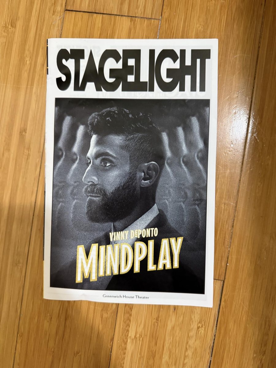
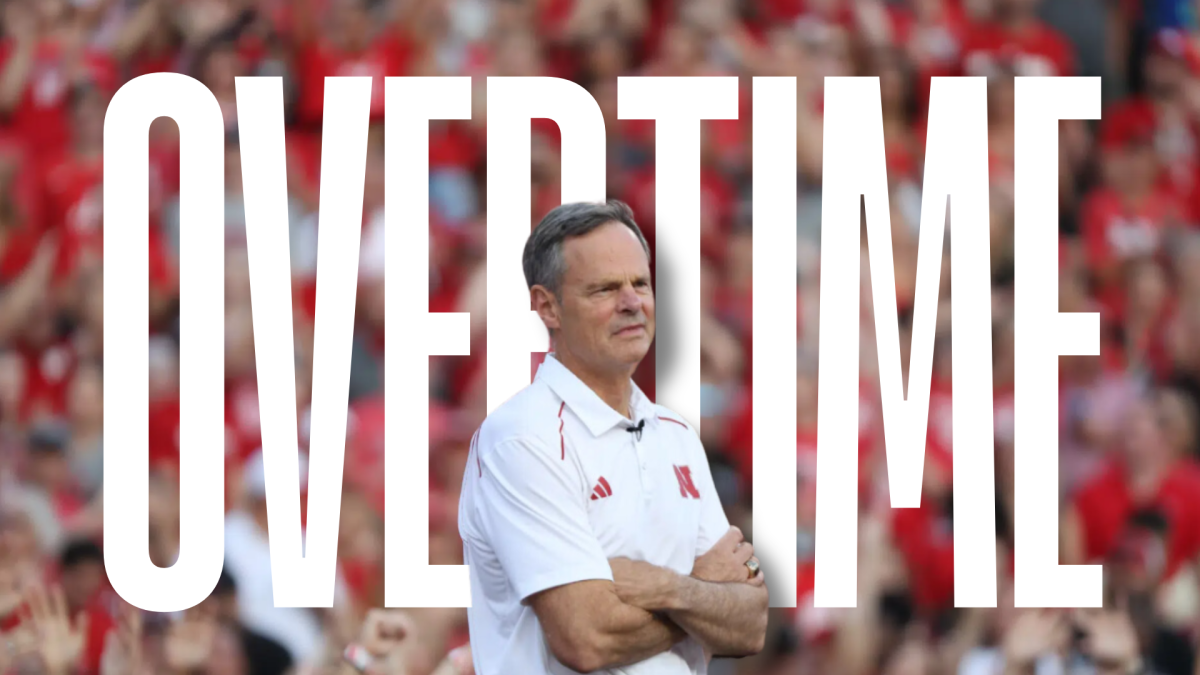
The Colorado Avalanche reverse retro uniforms are among the best in the sport. (Courtesy of Twitter)
Monday, Nov. 16 marked the unveiling of Adidas’ new Reverse Retro NHL jerseys. All 31 teams got a new sweater to rock for this upcoming season, and some of them will be flying off the shelves. Some others however … yikes.
These rankings are purely my opinion, taking into account what the team had to work with and whether or not I like them. That’s pretty much it.
These jerseys will be available for purchase on Dec. 1. There has been no announcement about whether there will be other merchandise, such as hoodies, shirts and hats with these colors, but I would imagine those are coming soon as well.
First, let’s define Reverse Retro. Head of Adidas Hockey, Dan Near was on the NHL Network on Monday night and said they were a modern twist on retro jerseys. I’m not sure that every team complied with that, but let’s take a look at all 31.
Images of all the jerseys can be found here.
Coming in dead last: Detroit Red Wings
Ah yes, right where they finished in the standings last year as well. They have one of the greatest jerseys in all of sports, and they came out with basically a practice jersey. Take their road jersey and strip it on any color besides the logo and tada, you did it. Pretty unimaginative for a team starting with a better base jersey then just about everyone else.
30: Anaheim Ducks
The logo is … weird. It’s a very large duck jumping out of a pond wielding a hockey stick. I would’ve loved to see another homage to the Mighty Duck days, but this peculiar one is what they came up with.
29: San Jose Sharks
Very bland. I don’t love the gray and would have liked them to come out with something that pops a little more. Not offensive, but it doesn’t move the needle.
28: Winnipeg Jets
Again, very bland. They went with a full gray jersey, which I don’t really understand. Although it uses the superior Jets logo, the rest is a miss.
27: New York Islanders
Swing and a miss. To go to a carbon copy of the early-2000s jerseys makes absolutely no sense. They could have gone a thousand ways with this, but instead they decided to do something no one is going to buy because they already have it. It could’ve been a full orange; it could’ve been a fisherman, but nope, navy! I can’t wait to watch a game and not even realize they’re wearing these until the second period because they’re basically the same as the regular ones.
26: Calgary Flames
I’m not afraid to admit I have no idea why there’s a horse on the jersey. Just simply no idea. It’s okay, though, because they vastly improved their regular jerseys.
25: Arizona Coyotes
It’s an homage to the green jerseys from 1999-2003, but it’s purple instead. The ’yotes have been known to try some funky uniforms over time, but this one doesn’t stick for me. I don’t love the desert scene on the bottom. I think that’s very odd.
24: Vegas Golden Knights
It’s tough to create a reverse retro when you’ve had literally one jersey ever. An alternate logo and going big with red are bold choices. It’s okay, but it doesn’t scream Golden Knights to me. I don’t think that the new gold alternate jerseys are that fantastic either — in fact, these are better.
23: St. Louis Blues
They took the Gretzky-era jerseys and flipped the color scheme, which is fine, but I never truly understood why the Blues had red in their jersey to begin with. All in all, I would have liked to see the yellow/gold color that we saw in the Winter Classic jerseys as the main color.
22: Philadelphia Flyers
It’s hard to go wrong with orange and black, but nothing is popping off the screen here. I feel like they could have been a little more ambitious, but it’s not offensive at all.
21: Vancouver Canucks
I am not a fan of color blocked anything, including this jersey. I like the green in Canucks jerseys; I just think they could have incorporated it better. In the end, it could have been much much worse given the history of Canuck jerseys.
20: Ottawa Senators
I like the logo, but the red is too much for me. It needs a little bit of white to balance it out. Not terrible overall, but not the best for sure.
19: Nashville Predators
The Preds decided to stick with the yellow as opposed to going way back to the blue from the beginning of their existence. I would have preferred the blue, just for a change of color, but these aren’t terrible. They’re very similar to the jerseys they had before the current ones. Very meh.
18: Toronto Maple Leafs
The logo is weird. I don’t like the sleeves either. It’s a little too similar to their regular jerseys for me to get extremely excited about it. Here in the middle is a good spot.
17: Dallas Stars
The throwback to the first time they made the Cup Final with the logo is awesome, but the rest doesn’t do much for me.
16: Edmonton Oilers
Awesome jersey no doubt, but it’s basically their regular road jersey, so it’s a little disappointing. I think it’s very possible the people who designed these were just as confused about “Reverse Retro” as I was.
15: Buffalo Sabres
I love the alternate logo, but the word “Buffalo” stamped on the bottom drops it in the rankings for me. The Winter Classic jersey from the year at Citi Field will always reign supreme in Sabre history, but this one is solid too.
14: Chicago Blackhawks
The black jersey is nice, and I like the red trim, but the logo is very odd. It’s the original Blackhawk logo, or very similar, but it seemed like the NHL was doing everything it could to hide the logo in the early releases. Of course, the Blackhawks logo falls under the same criticism that the Washington Football Team faced over the past decade, but there has been nothing done to change it. If the NHL was going to make a very obvious effort to hide the logo in the reveal, then maybe they should have gotten the team to pick a different logo?
13: Montreal Canadiens
They kept it simple by flipping the colors on their traditional jersey. It’s hard to argue with when you have such a great starting point, but isn’t as imaginative as some others.
12: Tampa Bay Lightning
I like the old logo as a throwback to the original Bolts jerseys, but the white shoulders are a little too much for me personally. Overall, though, this is a hit.
11: Pittsburgh Penguins
There has been a lot of hate towards this jersey, and I can’t say I understand it. Yes, the Lemieux/Jagr era sweaters with the black lettering were better, but I still like the font and design.
10: Columbus Blue Jackets
I think this is a solid jersey, I like moving away from the blue for really the first time in team history, and the logo is great. I think this will be one of the better selling jerseys in the collection because it’s very different from other ones, but it’s still very clear what team it is.
9: Washington Capitals
This is the definition of reverse retro. Old logo with current colors. The Eagle logo is back, and it’s awesome. The red is great, but the only thing I don’t like, similar to the Sabres, is “Capitals” written across the bottom.
8: Florida Panthers
I like this logo much better than the current one. And this color scheme for that matter. Yes, it’s basically their old jersey, but it looks great and much better than the current ones.
7: New Jersey Devils
The old green jerseys are back, and they look great. I’m really excited for it. It’s a classic throwback, and there’s nothing wrong with that.
6: Carolina Hurricanes
They brought back the Whalers jersey! Cue up the “Brass Bonanza”! Except it’s gray? Weird. But hey, it’s a great logo, and it’s back.
5: New York Rangers
The return of another great logo with Lady Liberty on the front of these sweaters. It could have used some more accenting colors, but all in all I like this a lot. It gave the fans what they wanted with a defunct logo coming back.
4: Minnesota Wild
They took their own logo and dropped the awesome North Stars colors on them. I literally can’t say anything negative about that. Awesome jersey.
3: Los Angeles Kings
The Kings’ best logo ever and their best color scheme ever combine for a whole bunch of awesome. It’s a shame that they stink, because this jersey is going to look great on TV, but we might just never see it on the East Coast.
2: Boston Bruins
I love the yellow, which I didn’t think I was going to. It combines the boldness of some of the other jerseys with the traditional logo and striping of an Original 6 sweater. Awesome all around.
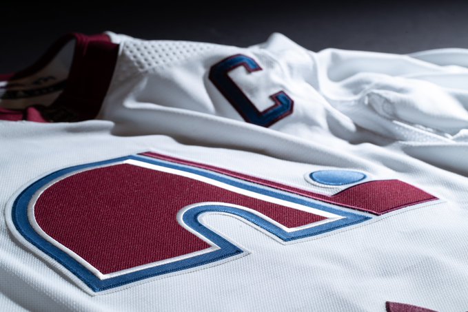
1: Colorado Avalanche
What can I say that hasn’t been said already? The Nordiques logo, a classic, with the top-notch Avs color scheme, plus an homage to the all-time Quebec colors with the puck and the C for captain ? A+ across the board. Bank accounts are quivering across the state of Colorado with this one.
A special thanks to my jersey ranking correspondent Jack Caldwell.