


New York City’s Classic Logo Gets A Facelift
New York City releases new logo, sparking online controversy. (Courtesy of Twitter)
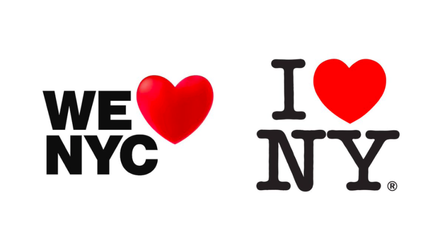
The “I ♥ NY” logo has been a staple of New York City for years. If you have ever been in the city, you’ve probably seen the logo on tourist T-shirts sold by your local street vendor. The logo is so iconic that I’ve seen cheap knockoffs of it for merchandise in other cities. However, New York officials decided that the logo needed an update. The new one, unveiled on March 20, has some noticeable differences, including a change of slogan to “We ♥ NYC,” a new font reminiscent of the subway signs and a new heart.
Even if you do not care about this news, you might be wondering: If the original logo was so iconic, then why the update? Well, the answer lies in the story behind the original logo’s creation. Designed by Milton Glaser during the 1970s, the logo became an integral part of an advertisement campaign to increase tourism to the city during a tumultuous period of economic struggles and rising crime rates. Ever since, “I ♥ NY” has become not only a smart advertisement, but an integral aspect of a New Yorker’s identity.
The “We ♥ NYC” campaign is meant to achieve similar goals. Kathryn Wylde, the president of the Partnership of New York City, who is leading the campaign, said that the new logo is meant to promote unity after the “divisiveness and negativity” during the COVID-19 pandemic. Wylde hopes that the updated campaign will help New Yorkers unite to fix their city’s problems and promote positivity. “We ♥ NYC” definitely united people, but for all the wrong reasons. Most New Yorkers agree: the new logo is ugly.
Over on Twitter, one user called it an insult to “underemployed artists/graphic designers.” The graphic design website Creative Bloq also weighed in, saying that the placement of the heart makes the logo look confusing, like it says “We NYC ♥.” In addition, the heart looks like someone just copied and pasted the heart emoji from their phone’s keyboard. Another Twitter user said that their “intro to graphic design professor in college would have absolutely dunked on the student that tried to submit this for a grade.” Audiences and graphic designers have drowned out the few positive responses. Still, one response from COLLINS Creative Director Joseph Han stated that people have always hated changes to logos, citing past examples such as the new American Airlines logo unveiled in 2013. However, he also stated that an update to a logo that people have grown accustomed to should only be changed for a good reason.
When I first saw the uproar over the logo, I thought it was funny. I mean, it’s just a logo, right? Everyone will probably be used to it eventually. However, I also know that since I never grew up in the city, I don’t have the same attachment to the logo that many New Yorkers cherish. While some of the responses are a little overdramatic, it’s definitely understandable that people might be upset at a logo change. People hate change, and I can relate. In a less serious example, as someone from Massachusetts, I remember the disappointment I and others felt when they updated Dunkin’ Donuts to just “Dunkin’” (which I still don’t like, by the way). The updated “We ♥ NYC” does look low-effort, and why would you change Graser’s already-iconic logo? It was definitely possible to retain Graser’s original format while changing the slogan from “I ♥ NY” to “We ♥ NYC” (see artist Ryan McGinness’s design).
More seriously, it’s unfortunate that the positive cause of the campaign, to unite New Yorkers after the past three difficult years, has been overshadowed by a design. Yes, people should care more about the issues in their city, but no one will if your advertising skills are not top-notch.
But let me play devil’s advocate here in defense of the new logo. I think it could have worked with a few tweaks to the final design. Here is some advice from a New York college student. (Keep in mind that I am speaking from an onlooker’s perspective, and I do not have any experience in graphic design or advertising.)
I like the new slogan, “We ♥ NYC,” as the “we” demonstrates a sense of much-needed collectivity to help unite New Yorkers. I don’t think the change from “NY” to “NYC” was necessary, but I do think it works if the campaign is primarily targeted to people in the city (sorry, rest of New York state). The first change I would make concerns the alignment. In Graser’s, the text and heart are centered with each other, while in the new one, I can’t tell if they are trying to center or align the text to the left. Center the logo and add some space between the first and second lines so the phrasing won’t look so awkward. I also think it is clever that they tried to use a font similar to the subway system’s. Maybe a decrease in its boldness would make the text less cluttered and evoke a similar simplicity from Graser’s logo.
However, the most egregious mistake in this new logo is the heart. It just looks completely out of place from the text. First of all, it’s too big, and second, why is it three-dimensional when the text is two-dimensional? Two simple changes could fix this problem: shrink the heart down to the size of the text, and make the heart two-dimensional or the text three-dimensional. Obviously, these are just some minor suggestions to fix the main issues, but I’ll leave it up to the professionals to give their more detailed and experienced input.
In a few years, everyone will probably look back on this whole “controversy” and laugh, if we even remember it. One thing is for certain: New Yorkers love Milton Graser’s logo just as much as their city. So, if you’re going to change the logo, you better make the money towards those changes well-spent.