


I judge every book and album by its cover. As people who consume media, it is in our nature to make assumptions and quick judgments based on what we can see at first glance. An album cover is more than just packaging; it is the authentic representation of the music inside coming straight from the perspective of the artist. A while back, there was a TikTok trend that encouraged people to take everyday pictures and stills from videos and turn them into album cover art. While the trend was fun and proved how most simple photos can be good album covers, many albums require covers that are thoughtful expressions of some greater message. Some of the most iconic album covers — and some of my favorites — are ones that pay attention to detail.
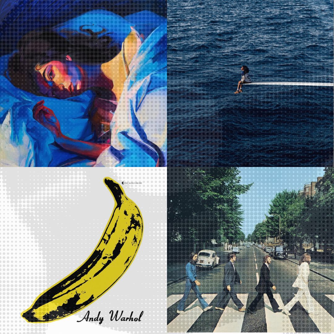
Personal preferences play a large role in the perception of album artwork, but there are some indisputably iconic covers that have maintained relevance since their conception, such as the album cover for “The Velvet Underground & Nico,” which is a collaboration between the rock band The Velvet Underground and Nico, a German singer. Andy Warhol designed this album cover, a neon yellow pop art print of a banana, with a controversial yet bold interactive element that was a part of most early copies of the album. The original editions of this album’s record sleeve featured instructions that urged listeners to “PEEL SLOWLY AND SEE.” If you peeled the sticker down, a suggestive, fleshy pink banana could be found peeking underneath the saturated yellow one. The element of shock and the progressive nature of evocative jokes like this one played a large role in cementing this album in the timeline of music.
Another iconic cover is the “Abbey Road” cover by the Beatles, which depicts a zebra crossing with singers John Lennon, Ringo Starr, Paul McCartney and George Harrison walking in a single file line across the street. Photographer Iain Macmillan captured this shot, and it checks all the boxes of a memorable cover — it’s quirky, effortless and artistic in its nature. The picture is symbolic of the art brought to life within the recording sessions in the Beatles’ “Abbey Road” studio, and each musician stands out in some way on the cover. Paul McCartney is captured barefoot; George Harrison is in a Canadian tuxedo and Ringo Star and John Lennon are boldly crossing the street in all black and white suits, respectively. These minute details work together to form the art. Listeners can sense both the band’s unity and each member’s individuality in this picture, despite it being the cover of the last album they recorded.
In some cases, album covers can serve as political statements, capturing cultural fervor that penetrates through cutting lyrics. One of the best examples of this is Kendrick Lamar’s “To Pimp a Butterfly.” A conscious hip-hop collection with a cover that taps into American history, this album tackles themes that mainstream media tends to skirt around. In a piece about the cultural moment that “To Pimp a Butterfly” evoked, Jamie Atkins describes the work as “an intense exploration of big themes: exploitation, living up to responsibilities, the importance of staying true to yourself, finding strength in the face of adversity.”
When the music is as sprawling and politically charged as the 16 tracks on this album are, the cover art has to be equally intricate. The thought that goes into a piece like that extends far beyond a quick snapshot picture taken for a TikTok trend. The album cover of “To Pimp a Butterfly” delineates a group of mostly Black men and children in front of the White House, and confronts American society in a raw, unadulterated way.
In an interview with Mass Appeal, Lamar said the photo represents “just taking a group of the homies who haven’t seen the world and putting them in these places that they haven’t necessarily seen, or only on TV and showing them something different other than the neighborhood and them being excited about it. That’s why they have them wild faces on there.” The intention that went into this cover holds a lot of significance in the execution of the final product and couldn’t be recreated by a picture from a TikTok trend.
In addition to these serious album covers, there are also album covers that fulfill no greater purpose than grasping the tone and direction of an album and illustrating that through art with an attractive appeal. I think the use of color, lighting and dimension on an album cover is integral to crafting something unforgettable. Lorde’s “Melodrama” and SZA’s “SOS” are some all-time favorites of mine. Album covers like these allow the artist to expand the impact of their music beyond the auditory level.
The “Melodrama” album art is a blue-lit painting of Lorde lying in bed. The strokes of hazy colors across her face communicate uncertainty and restlessness, showing the youthful themes that resurface throughout the tracks in the album. The moodiness sits deep and the drama feels intriguing. “SOS,” on the other hand, is a photograph of SZA sitting on the edge of a diving board with nothing but piercing blue waters surrounding her. The diving board juts in from the right side, and the image of SZA looking out at the sea, lighting up from the sun in front of her, is hopeful and elegant. Inspired by an image of Princess Diana, the photograph conveys isolation and independence, two critical subjects of the album. Even the title “SOS” plays into the idea of the artist being the only one who can truly save herself from her troubles. The art is tranquil in its simplicity, flowing perfectly with the overarching message of the songs.
While some artists are eager to spark conversations and reel in potential listeners, others take a minimalist approach, allowing the music to speak for itself. Others still take to the album covers as extensions of the tracklist, leaning into the greater aesthetic of the music. Regardless, the visual and sonic art elements of any record must work in tandem to produce some greater effect on the audience. Anything can be an album cover, but the cover of an album and the music itself have to work in unison, and that type of harmony often requires greater time and energy than is allowed for by the TikTok trend. If we are going to continue to judge the media by its cover — which I believe isn’t something we need to steer away from — then the cover deserves just as much attention as the art inside.