


On move-in weekend, first-years threaded through piles of duffel bags and mini-fridges toward the campus bookstore, where the newest Fordham University gear had just hit the shelves.
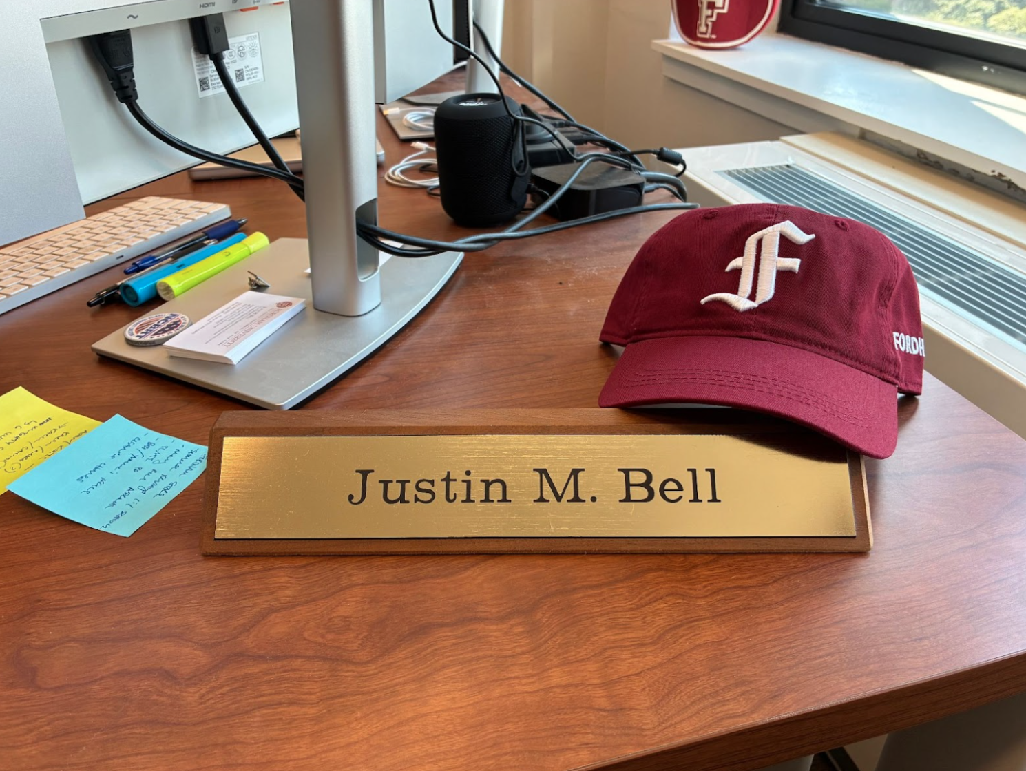
“As our new incoming class arrived for orientation, they started to get new swag,” Justin Bell, the university’s vice president for marketing and communications, said in an interview with The Fordham Ram. “We had it in the bookstore … when students are moving in and their families are shopping, they could actually find that new merchandise.”
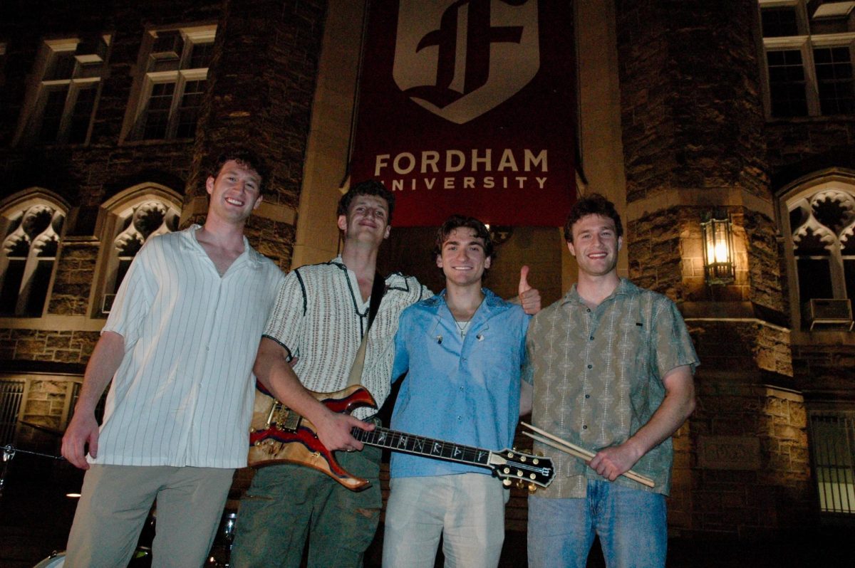
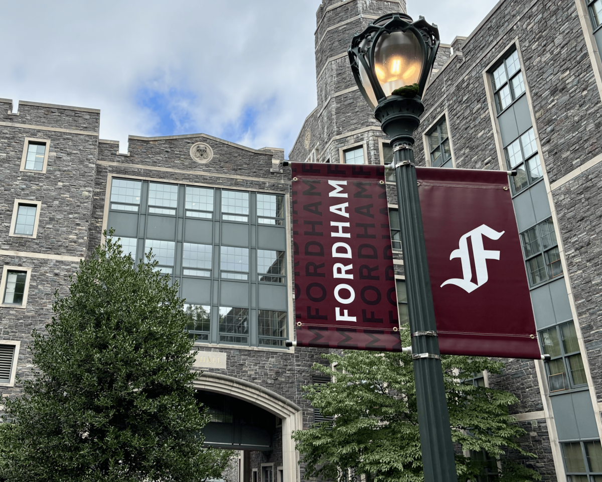
The logo on the new gear is no longer the block “F” that generations before have worn, but a new Gothic “F.” This change is the visible edge of a university-wide strategy which prioritizes a clearer, more consistent identity that can narrow awareness gaps, increase prestige and steady the story Fordham tells about itself.
Why the Change Matters
Bell says the new visual identity grew from the university’s most extensive audience research to date and a stark finding close to home. “Within the tri-state in our backyard, 16% … have never heard of Fordham. 21% has heard of Fordham, but couldn’t tell you that it’s a university,” he said.
Testing the old block F, the research “found less than 17% of New Yorkers could actually identify the block ‘F’ as Fordham.” Bell added that even by adding the ram to the logo, the number of New Yorkers who could identify the logo as Fordham only grew to 20%.
Yield and prestige were among other reasons for the rebranding. Fordham hovers around a 10% yield annually, meaning among all of the students that are admitted to Fordham, 10% will enroll.
Among the prospective undergraduates, 21% of those already in Fordham’s marketing funnel believe Fordham is very prestigious, compared with 39% of unaffiliated prospects, according to a slide deck shared by Bell with The Ram. “A strong, consistent brand should shift this so that as you get closer to the brand, prestige doesn’t suffer,” he added.
The purpose of the new font is as much verbal as visual. Bell describes four brand pillars, “depth, community, spirit and action,” and a campaign line meant to make Jesuit values legible to Generation Z. “That’s what ‘For What Matters’ is,” he said. “Our tagline, ‘The Jesuit University of New York,’ remains the same.”
The university’s Brand FAQ echoes that distinction: “Fordham will always be ‘The Jesuit University of New York,” the FAQ page says. “However, the tagline will no longer be locked up as part of Fordham’s visual identity … ‘For What Matters’ is a campaign slogan.”
The University’s Case
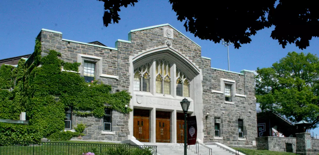
The university says the new letterform is not a break from history but a distillation of it. The FAQ says the Gothic letter “directly connects to Fordham’s distinctive architecture … providing a sense of historical continuity and timelessness.”
Bell points to the mark’s hidden references. “We do have Easter eggs … influenced by our traditions, who we are and our architecture,” he said, down to “two vertical pillars” that are supposed to resemble McKeon Hall and the Leon Lowenstein Center at the Lincoln Center campus.
He also stresses that this is bigger than a logo. “A brand is a living, breathing thing … What we’ve done is we’ve evolved it, we’ve polished it,” Bell said, adding that a brand health platform will track how the identity performs “quarter by quarter, year over year.”
Early readouts, he said, are encouraging: “Since the launch, we’re sitting about 87% positive sentiment in the marketplace,” based on social listening and message analysis.
Tradition and Taste Collide
For some students, the change lands like a shift in atmosphere. “[It] feels like Fordham has been stripped of its tradition with the minimalism aesthetic,” said Grace Chen, FCRH ’29, in response to an Instagram Story by The Ram.
“The new logo looks cheap and blended in with the thousand other minimalist / corporate logos,” Cleo Sellers, FCLC ’28, also said in response to the Instagram Story.
The evolved visual identity was announced through an Instagram post by Fordham’s official Instagram page on July 31. Responses by students and alumni came rolling in quickly after the university updates were released.
Georgia Bernhard, FCLC ’28, launched a petition to “Preserve Fordham’s Emblem” the day of the announcement, expecting perhaps a few hundred signatures as “some sort of funnel for the dissent.”
“There should be something at least somewhat tangible to show how many people are in opposition to it, and I had no idea it would spread as widely as it did,” she said.
Her critique goes beyond aesthetics. “Essentially, I think it unfairly effaces the history of the school,” she said in an interview with The Ram. “The aesthetic legacy the school has cultivated throughout time.”
Bernhard and a co-signer took their argument directly to Bell. “We communicated our points as to why we think the new branding isn’t fitting Fordham, that it doesn’t properly center its history and its legacy, and it puts those things in a backseat in favor of optimizing its marketing,” she said. “I think it’s good to try … At the very least, it’s good that they are being made aware that many people in Fordham’s community are against it.”
Bell calls that kind of friction inevitable. “Change is hard,” he said. “The most complex brand evolutions are professional sports teams and universities because there’s an emotional connection to the brand.”
Alumni and identity
John Choy, FCRH ’12, had a similar initial reaction to many students. However, after looking further into the new brand initiative, he understood the university’s choices.
“I remember looking on Instagram,” Choy said. “It kind of came as a shock to me.” After watching the symbolism video, he remained skeptical that viewers would notice the “Easter eggs.” “As an outside viewer, I think it’s hard to actually believe that all of those things were intentional … Without having seen that video or having read the website, people don’t know what each curve and point mean,” he said.
He also offered a blunt assessment of the old lettermark, something that research from the University also found. “The old F looks like a high school logo,” Choy said. “It’s not really unique. It’s iconic to really only Fordham students.”
Choy said the refresh could be the kind of jolt Fordham needs in a city where New York University and Columbia dominate people’s minds; after that, the choices often seem arbitrary. “It should be Fordham,” he said. “It always should have been Fordham. I think this rebrand will help push us back up there.”
Looking Forward
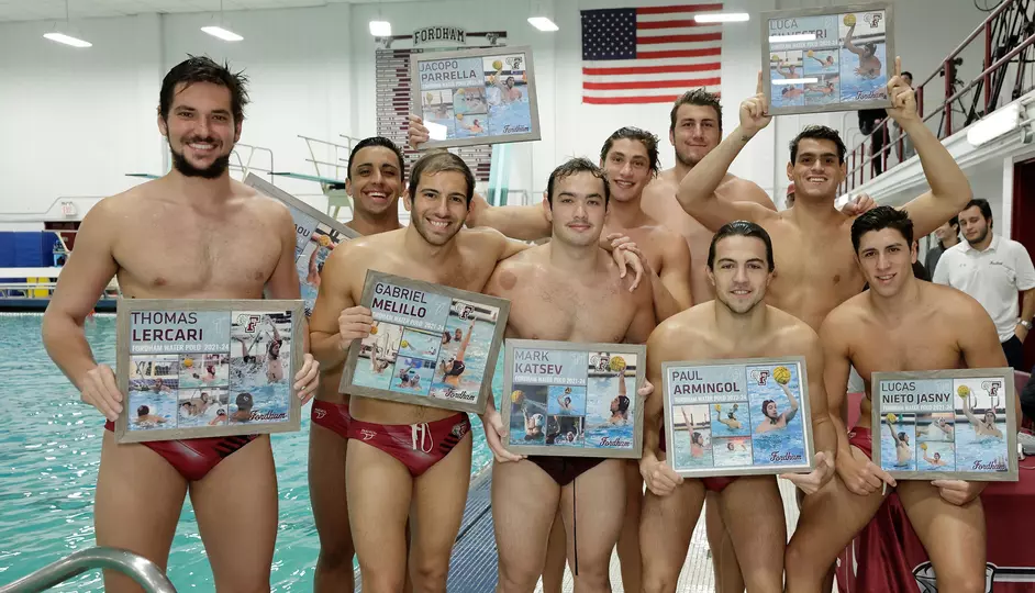
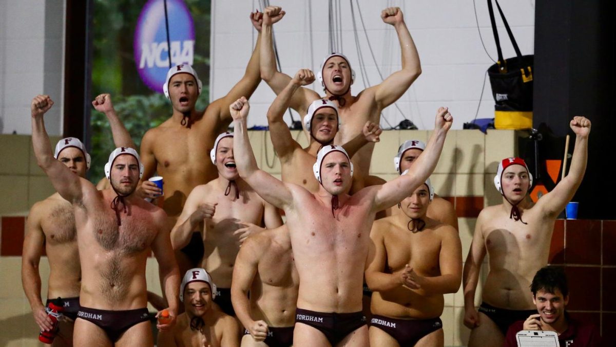
While some changes will roll out over time, according to Bell, many changes can already be seen on campus. Aside from the new merchandise in the bookstore, Keating Hall has a new banner portraying the Gothic “F.” Lightpost flags have also been changed to reflect the new logo. Athletics will transition to the new “F” beginning in spring 2026, while keeping the ram head.
Other pieces will arrive in phases: channels like marketing material will change first, then the long-run work of uniforms, facilities and fields.
“We’re not racing to change everything overnight,” Bell said, citing budget and life-cycle realities. “Where we are prioritizing is in the channels that we own. Website, social media, digital boards, [and] updating all of our materials for the new undergraduate recruitment cycle.”
Internally, the team will gauge awareness and perceptions across audiences as the new logo and message settle in.
For skeptics, the new logo remains something to be felt rather than decoded. For advocates, its promise rests in consistency and clarity. Between them lies the work of persuasion: showing, not telling, what a Gothic “F” can carry.


Karl Hoppé • Oct 7, 2025 at 7:43 pm
Cheap looking junk. It’s a blatant attempt to de-emphasise Fordham’s Catholic Jesuit roots. The seal is so distinctive, the only university seal other than Oxford, to display a baldric. Nothing about “f” indicates Fordham, it could be a discount mattress store’s logo. So sad to see Fordham go soullessly corporate.
Soltan • Sep 17, 2025 at 7:44 pm
It’s a lowercase f
Prove me wrong.